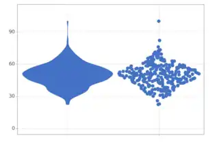
A violin plot (on the left) and a sina plot (on the right) for the same sample.
A sina plot is a type of diagram in which numerical data are depicted by points distributed in such a way that the width of the point distribution is proportional to the kernel density.[1][2] Sina plots are similar to violin plots, but while violin plots depict kernel density, sina plots depict the points themselves. In some situations, sina plots may be preferable to violin plots, because sina plots contain more information.[3][4]
There are a number of ways to create sina plots, in particular:
- The ggplot2 library of the R programming language.[5]
- The sinaplot library of the R programming language.[6]
- The plotnine library of the Python programming language.[7]
See also
References
- ↑ Sidiropoulos, Nikos; Sohi, Sina Hadi; Pedersen, Thomas Lin; Porse, Bo Torben; Winther, Ole; Rapin, Nicolas; Bagger, Frederik Otzen (2018-07-03). "SinaPlot: An Enhanced Chart for Simple and Truthful Representation of Single Observations Over Multiple Classes". Journal of Computational and Graphical Statistics. 27 (3): 673–676. doi:10.1080/10618600.2017.1366914. ISSN 1061-8600.
- ↑ Wilke, Claus (2019). Fundamentals of data visualization: a primer on making informative and compelling figures (First ed.). Beijing Boston Farnham Sebastopol Tokyo: O'Reilly. ISBN 978-1-4920-3108-6.
- ↑ "Sinaplot vs Violin plot - Why Sinaplot is better than Violinplot in R". GeeksforGeeks. 2023-02-03. Retrieved 2023-11-18.
- ↑ datavizpyr (2021-03-28). "Sinaplot vs Violin plot: Why Sinaplot is better than Violinplot - Data Viz with Python and R". Retrieved 2023-11-18.
- ↑ https://ggforce.data-imaginist.com/reference/geom_sina.html
- ↑ https://cran.r-project.org/web/packages/sinaplot/vignettes/SinaPlot.html
- ↑ https://plotnine.readthedocs.io/en/stable/generated/plotnine.geoms.geom_sina.html
This article is issued from Wikipedia. The text is licensed under Creative Commons - Attribution - Sharealike. Additional terms may apply for the media files.