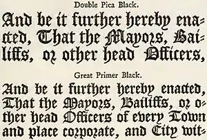
The r rotunda ⟨ ꝛ ⟩, "rounded r", is a historical calligraphic variant of the minuscule (lowercase) letter Latin r used in full script-like typefaces, especially blackletters.
Unlike other letter variants such as "long s" which originally were orthographically distinctive, r rotunda has always been a calligraphic variant, used when the letter ⟨r⟩ followed a letter with a rounded stroke towards the right side, such as ⟨o⟩, ⟨b⟩, ⟨p⟩, ⟨h⟩ (and ⟨d⟩ in typefaces where this letter has no vertical stroke; as in ⟨ẟ⟩, ⟨ꝺ⟩ and ⟨ð⟩). In this way, it is comparable to numerous other special types used for ligatures or conjoined letters in early modern typesetting.
Form

This symbol came in several different shapes, all of which were of x-height. The shape of the letter used in blackletter scripts Textualis as well as Rotunda is reminiscent of "half an r", namely, the right side of the Roman capital ⟨R⟩; it also looks similar to an Arabic numeral ⟨2⟩.
Like minuscules in general, this shape for r originated in the style of cursive writing that was common during the medieval period, which ultimately derived from scribal practice during Late Antiquity.
The r rotunda shape of cursive ⟨r⟩ resembling the numeral ⟨2⟩ is also found in a number of medieval scribal abbreviations containing ⟨r⟩, for example in the signs for the Latin word-final syllables ram, -orum and -arum.
There are several variant forms for the r rotunda glyph.
A very narrow second variant is found in some Textura manuscripts, in the form of one solid diamond atop another atop a vertical stroke. Another form found in German typefaces is a variant of that previous, with something like part of an ⟨s⟩ resembling an integral sign atop something rather like a ⟨c⟩. It can be found used as the second ⟨r⟩ of a pair and after ⟨e⟩. A fifth form, used in the 18th century in some French italic typefaces, was a derivative either of the Schrift form of the minuscule ⟨r⟩ or of similar typefaces used elsewhere. Its form was of a backwards ⟨J⟩ set just after the same shape rotated 180 degrees. They were separated by a space smaller than their stroke width, and the whole character was slanted as though it were cursive. As this typeface has the ⟨d⟩ whose ascender curves to the left (giving it a rounded right side), it was used after that character as well. By then, though, the character was the same width as a regular ⟨r⟩, so it was maintained because it appeared to its users to have some elegance or to remind them of prestigious old calligraphy.
Use for Tironian et

The abbreviation etc. was typeset using the Tironian et ⟨⁊⟩, as ⟨⁊c.⟩ in early incunables. Later, when typesets no longer contained a sort for the Tironian et, it became common practice to use the r rotunda glyph instead, setting ⟨ꝛc.⟩ for etc.[1]
Demise

Use of this form of r was never widespread except in blackletter scripts, so it fell out of use in English in the 16th century as roman scripts became predominant. Some modern cursive scripts use a letter ⟨r⟩ that has a resemblance to the r rotunda.
Encoding
| Preview | Ꝛ | ꝛ | ||
|---|---|---|---|---|
| Unicode name | LATIN CAPITAL LETTER R ROTUNDA | LATIN SMALL LETTER R ROTUNDA | ||
| Encodings | decimal | hex | dec | hex |
| Unicode | 42842 | U+A75A | 42843 | U+A75B |
| UTF-8 | 234 157 154 | EA 9D 9A | 234 157 155 | EA 9D 9B |
| Numeric character reference | Ꝛ | Ꝛ | ꝛ | ꝛ |

The letter was proposed to be added to Unicode in 2005, in the Latin Extended-D block.[2] It is included in Unicode 5.1 in both lower case and upper case forms,[3] although there seems to be no real evidence for the historical existence of a capital version and a normal capital R seems to have been used instead.[4]
Before that, the Medieval Unicode Font Initiative (MUFI) had allocated it in the Private Use Area (PUA) of medievalist fonts at U+F20E and U+F22D.[5] Since the characters are now available in Unicode, MUFI recommends that the Unicode code points be used, not the PUA code points.
Some fonts treat the glyph as a mere stylistic variant of ⟨r⟩ and may make it available by smart font features, e.g. Open Type 'hist', 'hlig', 'calt', 'salt' or 'ss**'.
Latin Extended-D also has characters for medieval scribal abbreviations. Among them is the abbreviation for the syllable rum, consisting of a r rotunda with a cut, resulting in a shape very similar to the astrological symbol for Jupiter ⟨♃⟩.
| Preview | Ꝝ | ꝝ | ||
|---|---|---|---|---|
| Unicode name | LATIN CAPITAL LETTER RUM ROTUNDA | LATIN SMALL LETTER RUM ROTUNDA | ||
| Encodings | decimal | hex | dec | hex |
| Unicode | 42844 | U+A75C | 42845 | U+A75D |
| UTF-8 | 234 157 156 | EA 9D 9C | 234 157 157 | EA 9D 9D |
| Numeric character reference | Ꝝ | Ꝝ | ꝝ | ꝝ |
See also
References
- ↑ Updike, Daniel Berkeley (1922). Printing Type – their History, Forms, and Use. Vol. I. Boston. p. 109.
{{cite book}}: CS1 maint: location missing publisher (link) - ↑ Everson, Michael; Haugen, Odd Einar; Emiliano, António; Pedro, Susana; Grammel, Florian; Baker, Peter; Stötzner, Andreas; Dohnicht, Marcus; Luft, Diana (2005). "Preliminary proposal to add medievalist characters to the UCS" (PDF).
- ↑ "Latin Extended-D" (PDF). unicode.org.
- ↑ West, Andrew (2006-07-24). "R Rotunda Part 2". BabelStone Blog. Retrieved 2020-02-09.
- ↑ Haugen, Odd Einar, ed. (5 July 2009). MUFI Code Chart Order Version 3.0 (PDF). ISBN 978-82-8088-403-9. Retrieved 24 March 2019.
{{cite book}}:|website=ignored (help)
External links
 Media related to R rotunda at Wikimedia Commons

