
Cartographic design or map design is the process of crafting the appearance of a map, applying the principles of design and knowledge of how maps are used to create a map that has both aesthetic appeal and practical function.[1] It shares this dual goal with almost all forms of design; it also shares with other design, especially graphic design, the three skill sets of artistic talent, scientific reasoning, and technology. As a discipline, it integrates design, geography, and geographic information science.
Arthur H. Robinson, considered the father of cartography as an academic research discipline in the United States, stated that a map not properly designed "will be a cartographic failure." He also claimed, when considering all aspects of cartography, that "map design is perhaps the most complex."[2]
History
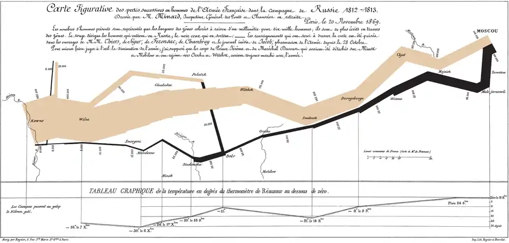
From ancient times to the 20th century, cartography was a craft or trade. Most map makers served several years as an apprentice, learning the skills of the master, with little room for innovation other than adapting to changing production technology. That said, there were notable exceptions, such as the occasional introduction of a novel Map projection, and the advent of thematic mapping in the 19th century highlighted by the work of Charles Dupin and Charles Joseph Minard in France. As late as 1948, Erwin Raisz's General Cartography, the standard English textbook on the subject, reads as a set of instructions of how to construct maps in keeping with tradition, with very little reflection on why it is done that way.[3] This was despite the fact that Raisz himself was a very creative designer, developing techniques as varied as cartograms and a style of Terrain depiction on physiographic maps that few have been able to replicate.[4]
Advances in cartographic production technology in the 20th century, especially the advent and widespread availability of color Offset printing, then a multitude of advances spurred on by World War II, such as Photolithography, gave cartographers a larger palette of design options, and made it easier to creatively innovate. This was synchronized with the widespread expansion of higher education, during which most cartography training transitioned from an apprenticeship to a college degree (typically using Raisz's textbook in America). The new generation of cartography professionals and professors began to reflect on why some maps seemed to be better (in beauty and function) than others, and to think of ways to improve design. Perhaps chief among them was Arthur H. Robinson, whose short but seminal work The Look of Maps (1952) set the stage for the future of cartographic design,[5] both for his early theorizing about map design, and for his honest acknowledgment of what was not yet known, soon spawning dozens of PhD dissertations. His subsequent textbook, Elements of Cartography (1953), was a marked departure from the past, with a major focus on design, claiming to "present cartography as an intellectual art and science rather than as a sterile system of drafting and drawing procedures."[2]
Since the 1950s, a significant focus of cartography as an academic discipline has been the cartographic communication school of thought,[6] seeking to improve design standards through increased scientific understanding of how maps are perceived and used, typically based on cognate disciplines such as psychology (especially perception, Gestalt psychology, and psychophysical experimentation), Human vision, and geography. This focus began to be challenged towards the end of the 1980s by the study of critical cartography, which drew attention to the influence of social and political forces on map design. A second major research track has been the investigation of the design opportunities offered by changing technology, especially computer graphics starting in the 1960s, geographic information systems starting in the 1970s, and the Internet starting in the 1990s. However, as much or more of the recent innovation in cartographic design has been at the hands of professional cartographers and their sharing of resources and ideas through organisations such as the International Cartographic Association and through national mapping societies such as the North American Cartographic Information Society and the British Cartographic Society.
Map types
A wide variety of different types of maps have been developed, and are available to use for different purposes. In addition to the general principles of cartographic design, some types of visualizations have their its own design needs, constraints, and best practices.
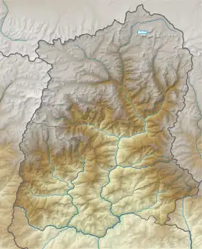
- Terrain/Relief/Topography. Several methods have been developed for visualizing elevation and the shape of the Earth's surface. Some techniques date back hundreds or thousands of years and are difficult to replicate digitally, such hill profiles and hachures; others, such as shaded relief and contour lines, are much easier to produce in GIS than using manual tools. Some of these methods are designed for analytical use, such as measuring slope on contours, but most are intended to produce an intuitive visual representation of the terrain.
- A Choropleth map visualizes statistical data that has been aggregated into a priori districts (such as countries or counties) using area symbols based on the visual variables of color and/or pattern. Choropleth maps are by far the most popular kind of thematic maps due to the widespread availability of aggregated statistical data (such as census data, but the nature of aggregate data can result in significant misinterpretation issues, such as the Ecological fallacy and the Modifiable areal unit problem, which can be somewhat mitigated by careful design.
- A Dasymetric map is a hybrid type that uses additional data sources to refine the boundaries of a choropleth map (especially through excluding uninhabited areas), thereby mitigating some of the sources of misinterpretation.
- A Proportional symbol map visualizes statistical data of point symbols, often circles, using the visual variable of size. The underlying data may be of point features, or it may be the same aggregate data used in choropleth maps. In the latter case, the two map types are often complimentary, as variables that are inappropriate to represent in one type are well-suited for the other.
- A Cartogram purposefully distorts the size of areal features proportional to a chosen variable, such as total population, and thus may be thought of as a hybrid between choropleth and proportional symbol maps. Several automated and manual techniques have been developed to construct cartograms, each having advantages and disadvantages. Frequently, the resultant shapes are filled as a choropleth map representing a variable thought to relate in some way to the area variable.
- An Isarithmic map (or isometric or isopleth or contour) represents a continuous field by interpolating lines wherein the field variable has equal value (an isoline). The lines themselves and/or the intervening regions may be symbolized. Some choropleth maps may be thought of as rough approximations of isarithmic maps, and dasymetric maps as slightly better approximations.
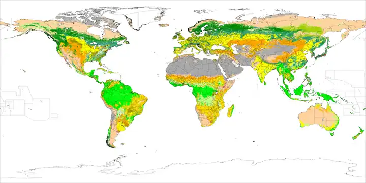
- A Chorochromatic map (or area-class) visualizes a discrete/nominal Field (geography) as a set of regions of homogeneous value.
- A Dot distribution map (or dot density) visualizes the density of an aggregate group as representative dots (each of which may represent a single individual or a constant number of individuals). The source data may be the actual point locations of the individuals, or choropleth-type aggregate district statistics.
- A Flow map focuses on lines of movement. A wide variety of flow maps exist, depending on whether flow volume is represented (usually using visual variables such as stroke weight or color value), and whether the route of flow is shown accurately (such as a navigation route on a Road map) or schematically (such as a Transit map or airline route map)
Although these are called separate "maps," they should be thought of as single map layers, which may be combined with other thematic or feature layers in a single map composition. A bivariate map uses one or more of the methods above to represent two variables simultaneously; three or more variables produce a multivariate map.
Design process
As map production and reproduction technology has advanced, the process of designing and producing maps has changed considerably. Most notably, GIS and graphics software not only makes it easier and faster to create a map, but it facilitates a non-linear editing process that is more flexible than in the days of manual cartography. There is still a general procedure that cartographers generally follow:[8][9]
- Planning: The iterative nature of modern cartography makes this step somewhat less involved than before, but it is still crucial to have some form of plan. Typically, this involves answering several questions:[10]
- What is the purpose of the map? Maps serve a wide variety of purposes; they may be descriptive (showing the accurate location of geographic features to be used in a variety of ways, like a street map), exploratory (showing the distribution of phenomena and their properties, to look for underlying patterns and processes, like many thematic maps), explanatory (educating the audience about a specific topic), or even rhetorical (trying to convince the audience to believe or do something).
- Who is the audience? Maps will be more useful if they cater to the intended audience.[11] This audience could range from the cartographer herself (desiring to learn about a topic by mapping it), to focused individuals or groups, to the general public. Several characteristics of the audience can aid this process, if they can be determined, such as: their level of knowledge about the subject matter and the region being covered; their skill in map reading and understanding of geographic principles (e.g., do they know what 1:100,000 means?); and their needs, motivations and biases.
- Is a map the best solution? There are times when a map could be made, but a chart, photograph, text, or other tool may better serve the purpose.
- What datasets are needed? The typical map will require data to serve several roles, including information about the primary purpose, as well as supporting background information.
- What medium should be used? Different mapping media, such as posters, brochures, folded maps, page maps, screen displays, and web maps have advantages and disadvantages for different purposes, audiences, and usage contexts.
- Data Collection: In the era of Geographic information systems, it seems like vast amounts of data are available for every conceivable topic, but they must be found and obtained. Frequently, available datasets are not perfect matches for the needs of the project at hand, and must be augmented or edited. Also, it is still common for there to be no available data on the specific topic, requiring the cartographer to create them, or derive them from existing data using GIS tools.[11]
- Design and Implementation: This step involves making decisions about all of the aspects of map design, as listed below, and implementing them using computer software. In the manual drafting era, this was a very linear process of careful decision making, in which some aspects needed to be implemented before others (often, projection first). However, current GIS and graphics software enables interactive editing of all of these aspects interchangeably, leading to a non-linear, iterative process of experimentation, evaluation, and refinement.
- Production and Distribution: The last step is to produce the map in the chosen medium, and distribute it to the audience. This could be as simple as a desktop printer, or sending it to a press, or developing an interactive Web mapping site.
Map

Cartographic design is one part of a larger process in which maps play a central role. This cartographic process begins with a real or imagined environment or setting. As map makers gather data on the subject they are mapping (usually through technology and/or remote sensing), they begin to recognize and detect patterns that can be used to classify and arrange the data for map creation (i.e., they think about the data and its patterns as well as how to best visualize them on a map). After this, the cartographer compiles the data and experiments with the many different methods of map design and production (including generalization, symbolization, and other production methods) in an attempt to encode and portray the data on a map that will allow the map user to decode and interpret the map in the way that matches the intended purpose of the map maker. Next, the user of the map reads and analyzes the map by recognizing and interpreting the symbols and patterns that are found on the map. This leads the user to take action and draw conclusions based on the information that they find on the map. In this way, maps help shape how we view the world based on the spatial perspectives and viewpoints that they help create in our mind.[12]
Goals
While maps serve a variety of purposes, and come in a variety of styles, most designs share common goals. Some of the most commonly stated include:
- Accuracy, the degree to which the information on the map corresponds to the nature of the real world. Traditionally, this was the primary determinant of quality cartography. It is now accepted, due largely to studies in Critical cartography, that no dataset or map is a perfect reproduction of reality, and that the subjective biases and motivations of the cartographer are virtually impossible to circumvent. That said, maps can still be crafted to be as accurate as possible, honest about their shortcomings, and leverage their subjectivity.
- Functionality, the usefulness of the map to achieve its purpose. During much of the latter 20th century, this was the primary goal of academic cartography, especially the Cartographic Communication school of thought: to determine how to make the most efficient maps as conduits of information.
- Clarity, the degree to which the map makes its purpose obvious and its information easy to access. Clarity can be achieved through removing all but the most important information, but this comes at the expense of other goals.[10]
- Richness, the volume and diversity of information the reader can glean from the map. Even maps with a narrowly-defined purpose often require the reader to see patterns in large amounts of data.
- Aesthetic appeal, a positive emotional reaction to the overall appearance of the map. Maps may be appreciated as "beautiful," but other positive affects include "interesting," "engaging," "convincing," and "motivating." Aesthetic reactions can be negative as well, such as "ugly," "cluttered," "confusing," "complicated," "annoying," or "off-putting."
These goals often seem to be in conflict, and it may be tempting to prioritize one over the others. However, quality design in cartography, as in any other design field, is about finding creative and innovative solutions to achieve multiple goals.[8] According to Edward Tufte,[13]
What is to be sought in designs for the display of information is the clear portrayal of complexity. Not the complication of the simple; rather the task of the designer is to give visual access to the subtle and the difficult--that is, the revelation of the complex.
In fact, good design can produce synergistic results. Even aesthetics can have practical value: potential map users are more likely to pick up, and more likely to spend time with, a beautiful map than one that is difficult to look at. In turn, the practical value of maps has gained aesthetic appeal, favoring those that exude a feeling of being "professional," "authoritative," "well-crafted," "clear," or "informative." In 1942, cartographer John K. Wright said,[14]
An ugly map, with crude colors, careless line work, and disagreeable, poorly arranged lettering may be intrinsically as accurate as a beautiful map, but it is less likely to inspire confidence.
Rudolf Arnheim, an art theorist, said this about the relationship between maps and aesthetics in 1976:[15]
The aesthetic or artistic qualities of maps are sometimes thought to be simply matters of so-called good taste, of harmonious color schemes and sensory appeal. In my opinion, those are secondary concerns. The principal task of the artist, be he a painter or a map designer, consists of translating the relevant aspects of the message into the expressive qualities of the medium in such a way that the information comes across as a direct impact of perceptual forces. This distinguishes the mere transmission of facts from the arousal of meaningful experience.
More recently, cartographers have recognised the central role of aesthetics in cartographic design and called for greater focus on how this role functions over time and space. For example, in 2005, Dr Alex Kent (former President of the British Cartographic Society) recommended:[16]
It will thus be more useful to cartographers and the development of cartography in general to undertake further research towards understanding the role of aesthetics in cartography than to pursue universal principles. Some possible topics for investigation include:
1. A history of the development of aesthetics in cartography;
2. An exploration of geographical variations in cartographic aesthetics; and
3. A critical examination of the factors influencing aesthetic decisions in contemporary mapmaking.
Map purpose and selection of information

Robinson codified the mapmaker's understanding that a map must be designed foremost with consideration to the audience and its needs, stating that from the very beginning of mapmaking, maps "have been made for some particular purpose or set of purposes".[17] The intent of the map should be illustrated in a manner in which the percipient (the map reader) acknowledges its purpose in a timely fashion.[18] The principle of figure-ground refers to this notion of engaging the user by presenting a clear presentation, leaving no confusion concerning the purpose of the map. This will enhance the user's experience and keep their attention. If the user is unable to identify what is being demonstrated in a reasonable fashion, the map may be regarded as useless.
Making a meaningful map is the ultimate goal. Alan MacEachren explains that a well designed map "is convincing because it implies authenticity".[19] An interesting map will no doubt engage a reader. Information richness or a map that is multivariate shows relationships within the map. Showing several variables allows comparison, which adds to the meaningfulness of the map. This also generates hypothesis and stimulates ideas and perhaps further research. In order to convey the message of the map, the creator must design it in a manner which will aid the reader in the overall understanding of its purpose. The title of a map may provide the "needed link" necessary for communicating that message, but the overall design of the map fosters the manner in which the reader interprets it.[20]
In the 21st century it is possible to find a map of virtually anything from the inner workings of the human body to the virtual worlds of cyberspace. Therefore, there are now a huge variety of different styles and types of map – for example, one area which has evolved a specific and recognisable variation are those used by public transport organisations to guide passengers, namely urban rail and metro maps, many of which are loosely based on 45 degree angles as originally perfected by Harry Beck and George Dow.
Aspects of design
Unlike cognate disciplines such as Graphic design, Cartography is constrained by the fact that geographic phenomena are where and what they are. However, within that framework the cartographer has a great deal of control over many aspects of the map.
Cartographic data and generalization
The widespread availability of data from Geographic information systems, especially free data such as OpenStreetMap, has greatly shortened the time and cost of creating most maps. However, this part of the design process is still not trivial. Existing GIS data, often created for management or research purposes, is not always in a form that is most suited to a particular map purpose, and data frequently need to be augmented, edited, or updated to be useful. Some sources, especially in Europe, refer to the former as a Digital Landscape Model, and spatial data that are fine-tuned for map design as a Digital Cartographic Model.[21]
A significant part of this transformation is generalization, a set of procedures for adjusting the amount of detail (geometry and attributes) in datasets to be appropriate for a given map. All maps portray a small, strategic sample of the infinite amount of potential information in the real world; the strategy for that sample is largely driven by the scale, purpose, and audience of the map.[22] The cartographer is thus constantly making judgements about what to include, what to leave out and what to show in a slightly incorrect place. Most often, generalization starts with detailed data created for a larger scale, and strategically removes information deemed to be unnecessary for a smaller scale map. This issue assumes more importance as the scale of the map gets smaller (i.e. the map shows a larger area) because the information shown on the map takes up more space on the ground. For example, a 2mm thick highway symbol on a map at a scale of 1:1,000,000 occupies a space 2 km wide, leaving no room for roadside features. In the late 1980s, the Ordnance Survey's first digital maps, where the absolute positions of major roads were sometimes moved hundreds of meters from their true location on digital maps at scales of 1:250,000 and 1:625,000 (the generalization technique of displacement), because of the overriding need to annotate the features.
Projections
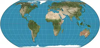
Because the Earth is (nearly) spherical, any planar representation (a map) requires it to be flattened in some way, known as a projection. Most map projections are implemented using mathematical formulas and computer algorithms based on geographic coordinates (latitude, longitude). All projections generate distortions such that shapes and areas cannot both be conserved simultaneously, and distances can never all be preserved.[23] The mapmaker must choose a suitable map projection according to the space to be mapped and the purpose of the map; this decision process becomes increasingly important as the scope of the map increases; while a variety of projections would be indistinguishable on a city street map, there are dozens of drastically different ways of projecting the entire world, with extreme variations in the type, degree, and location of distortion.
Interruptions and arrangements
World maps are often designed by cutting the globe into smaller pieces, using a different projection for each piece, and then arranging all those small maps into a single map on one piece of paper, with discontinuities between the small maps. Perhaps the earliest types of such interrupted arrangements are various maps composed of 2 disks showing 2 hemispheres of Earth, one disk centered on some point selected by the cartographer and the other disk centered on its antipode. More recently, cartographers have experimented with a wide variety of interrupted arrangements of projections, including homolosine and polyhedral maps.[24]
Symbology
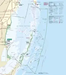
Cartographic symbology encodes information on the map in ways intended to convey information to the map reader efficiently, taking into consideration the limited space on the map, models of human understanding through visual means, and the likely cultural background and education of the map reader. Symbology may be implicit, using universal elements of design, or may be more specific to cartography or even to the map. National topographic map series, for example, adopt a standardised symbology, which varies from country to country.[25]
Jacques Bertin, in Sémiologie Graphique (1967), introduced a system of codifying graphical elements (including map symbols) that has been a part of the canon of Cartographic knowledge ever since.[26] He analyzed graphical objects in terms of three aspects (here using current terminology):
- Dimension: The basic type of geometric shape used to represent a geographic phenomenon, commonly points (marker symbols), lines (stroke symbols), or areas (fill symbols), as well as fields.
- Level of measurement: the basic type of property being visualized, generally using the classification of Stanley Smith Stevens (nominal, ordinal, interval, ratio), or some extension thereof.
- Visual variable: the graphical components of a symbol, including shape, size, color, orientation, pattern, transparency, and so on.
Thus, a map symbol consists of a number of visual variables, graphically representing the location and spatial form of a geographic phenomenon, as well as zero or more of its properties. For example, ![]() might represent the point location of a facility, with shape being used to represent that the facility type is "mine" (a nominal property). This symbol would be intuitively understood by many users without any explanation. On a Choropleth map of median income, A dark green fill might represent an area location of a county, with hue and value being used to represent that the income is US$50,000 (a ratio property). This is an example of an ad hoc symbol with no intrinsic meaning, requiring a legend for users to discover the intended meaning.
might represent the point location of a facility, with shape being used to represent that the facility type is "mine" (a nominal property). This symbol would be intuitively understood by many users without any explanation. On a Choropleth map of median income, A dark green fill might represent an area location of a county, with hue and value being used to represent that the income is US$50,000 (a ratio property). This is an example of an ad hoc symbol with no intrinsic meaning, requiring a legend for users to discover the intended meaning.
Labeling and typography
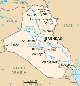
Text serves a variety of purposes on maps.[10] Most directly, it identifies features on the map by name; in addition, it helps to classify features (as in "Jones Park");[21] it can explain information; it can help to locate features, in some cases on its own without a geometric map symbol (esp. natural features); it plays a role in the gestalt of the map, especially the visual hierarchy;[21] and it contributes to the aesthetic aspects of the map, including its "look and feel" and its attractiveness. While the cartographer has a great deal of freedom in choosing the style and size of type to accomplish these purposes, two basic goals are seen as crucial:[21][27]
- Legibility, the ease with which map users can read a particular piece of text. Map labels introduce unique challenges to legibility, due to their tendency to be small, unfamiliar, irregularly spaced, and placed on top of map symbols.[28]
- Association, the ease with which map users can recognize which feature a particular piece of text is labeling. This can be especially challenging on general purpose maps containing a large number of varied features and their labels.
Most of the elements of labeling design are intended to achieve these two goals, including: the choice of typefaces, type style, size, color, and other visual variables; halos, masks, leader lines, and other additional symbols; decisions about what to label and what to not label; label text content; and label placement. While many of these decisions are specific to the particular map, functional label placement tends to follow a number of rules that have been developed through cartographic research,[29] which has led to automated algorithms to place them automatically, to a reasonable degree of quality.
Placenames
One challenge for map labeling is dealing with varying preferences of place names. Although maps are often made in one specific language, place names often differ between languages. So a map made in English may use the name Germany for that country, while a German map would use Deutschland and a French map Allemagne. A non-native term for a place is referred to as an exonym. Sometimes a name may be disputed, such as Myanmar vs. Burma. Further difficulties arise when transliteration or transcription between writing systems is required. Some well-known places have well-established names in other languages and writing systems, such as Russia or Rußland for Росси́я, but in other cases a system of transliteration or transcription is required. Sometimes multiple transliteration systems exist; for example, the Yemeni city of المخا is written variously in English as Mocha, Al Mukha, al-Makhā, al-Makha, Mocca and Moka. Some transliteration systems produce such different place names as to cause confusion, such as the transition of Chinese–English transliteration from Wade–Giles (Peking, Kwangchow) to Pinyin (Beijing, Guangzhou).
Composition
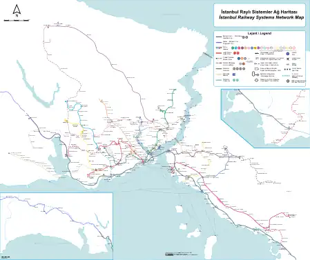
The term map composition is sometimes used to refer to the composition of the symbols within the map itself, and sometimes to the composition of the map and other elements on the page. Some of the same principles apply to both processes, while others are unique to each. In the former sense of the symbols on the map, as all of the symbols and thematic layers on the map are brought together, their interactions have major effects on map reading.
A number of composition principles have been studied in cartography. While some of these ideas were posited by Arthur H. Robinson in The Look of Maps (1952),[5] Borden Dent was likely the first to approach it in a systematic way in 1972, firmly within the Cartographic Communication school of thought.[30] Dent's model drew heavily on psychology, especially Gestalt psychology and Perception, to evaluate what made some maps difficult to read as a whole, even when individual symbols were designed well, and creating a model that included most of the list below. Later, artistic composition principles were adopted from graphic design, many of which are similar, having come from similar sources. They all share the same goal: to combine all of the individual symbols into a single whole that achieves the goals above.
- Contrast is the degree of visual difference between graphic elements (e.g., map symbols). Robinson saw contrast as the fundamental principle of composition, supporting everything else.[5] As suggested by Robinson, and further developed by Jacques Bertin, contrast is created by manipulating the visual variables of map symbols, such as size, shape, and color.[26]
- Figure-ground is the ease with which each individual symbol or feature (the figure) can be mentally isolated from the rest of the map (the ground). The rules for establishing figure-ground are largely drawn from the gestalt principle of Prägnanz.
- Visual hierarchy is the apparent order of items, from those that look most important (i.e., attract the most attention) to those that look least important. Typically, the intent is for the visual hierarchy to match the intellectual hierarchy of what is intended to be more or less important. Bertin suggested that some of the visual variables, especially size and value, naturally contributed to visual hierarchy (which he termed as dissociative), while others had differences that were more easily ignored.
- Grouping (Dent) or Selectivity (Bertin) is the ease with which a reader can isolate all of the symbols of a particular appearance, while ignoring the rest of the map, allowing the reader to identify patterns in that type of feature (e.g., "where are all the blue dots?"). In Bertin's model, size, value, and hue were particularly selective, while others, such as shape, require significant contrast to be useful.[26]
- Harmony is how well all of the individual elements (map symbols) "look good" together. This generally follows from the above principles, as well as the careful selection of harmonious colors, textures, and typefaces.
Layout

A typical map, whether on paper or on a web page, consists of not only the map image, but also other elements that support the map:[8]
- A title tells the reader what the map is about, including the purpose or theme, and perhaps the region covered.
- A legend or key explains the meaning of the symbols on the map
- A neatline may frames the entire map image, although many maps use negative space to set the map apart
- A compass rose or north arrow provides orientation
- Inset maps may serve several purposes, such as showing the context of the main map in a larger area, showing more detail for a subset of the main map, showing a separated but related area, or showing related themes for the same region.
- A bar scale or other indication of scale translates between map measurements and real distances.
- Illustrations may be included to help explain the map subject or add aesthetic appeal.
- Explanatory text may discuss the subject further
- Metadata declares the sources, date, authorship, projection, or other information about the construction of the map.
Composing and arranging all of the elements on the page involves just as much design skill and knowledge of how readers will use the map as designing the map image itself. Page composition serves several purposes, including directing the reader's attention, establishing a particular aesthetic feel, clearly stating the purpose of the map, and making the map easier to understand and use.[8] Therefore, Page layout follows many of the same principles of Composition above, including figure-ground and Visual hierarchy, as well as aesthetic principles adopted from Graphic design, such as balance and the use of White space (visual arts). In fact, this aspect of cartographic design has more in common with graphic design than any other part of the craft.
Reproduction and distribution
At one time, the process of getting a map printed was a major part of the time and effort spent in cartography. While less of a concern with modern technology, it is not insignificant. Professional cartographers are asked to produce maps that will be distributed by a variety of media, and understanding the various reproduction and distribution technologies help to cater a design to work best for the intended medium.
- Inkjet printing
- Laser printing
- Offset printing, including Prepress preparation
- Animated mapping
- Web mapping
See also
References
- ↑ Hogräfer, M., Heitzler, M. and Schulz, H.‐J. (2020), The State of the Art in Map‐Like Visualization. Computer Graphics Forum, 39: 647-674. https://doi.org/10.1111/cgf.14031
- 1 2 Robinson, A.H. (1953). Elements of Cartography. New York: John Wiley & Sons. ISBN 978-0-471-72805-4.
- ↑ Raisz, Erwin, General Cartography, 2nd Edition, McGraw-Hill, 1948
- ↑ Tyner, Judith, Elements of Cartography: Tracing Fifty Years of Academic Cartography, Cartographic Perspectives, #51 (Spring 2005), 4
- 1 2 3 Robinson, Arthur, The Look of Maps, University of Wisconsin, 1952
- ↑ Kent, Alexander J. (2018). "Form Follows Feedback: Rethinking Cartographic Communication". Westminster Papers in Communication and Culture. 13 (2): 96–112. doi:10.16997/wpcc.296.
- ↑ Mark P. Kumler & Richard E. Groop (1990) Continuous-Tone Mapping of Smooth Surfaces, Cartography and Geographic Information Systems, 17:4, 279-289, DOI: 10.1559/152304090783805681
- 1 2 3 4 Dent, Borden D., Jeffrey S. Torguson, Thomas W. Hodler, Cartography: Thematic Map Design, 6th Edition, McGraw-Hill, 2009, p.205
- ↑ Slocum, Terry A., Robert B. McMaster, Fritz C. Kessler, Hugh H. Howard, Thematic Cartography and Visualization, 3rd Edition, Pearson-Prentice Hall, 2009, p.212
- 1 2 3 Tyner, Judith A., Principles of Map Design, Guilford Press, 2010, p.23
- 1 2 Muehrcke, Phillip, An Integrated Approach to Map Design and Production, The American Cartographer, V.9 #2 pp.109-122, doi:10.1559/152304082783948529
- ↑ "3.1 The Cartographic Process | GEOG 160: Mapping our Changing World". www.e-education.psu.edu. Retrieved 2019-12-14.
- ↑ Tufte, Edward, The Visual Display of Quantitative Information, 2nd Edition, Graphics Press, 2001, p.191
- ↑ Wright, John K., Map Makers are Human, Geographical Review, V. 32, p.542
- ↑ Arnheim, Rudolf (1976). "The Perception of Maps". The American Cartographer. 3 (1): 5–10. doi:10.1559/152304076784080276.
- ↑ Kent, Alexander J. (2005). "Aesthetics: A Lost Cause in Cartographic Theory?". The Cartographic Journal. 42 (2): 182–188. doi:10.1179/000870405X61487. S2CID 129910488. Retrieved 28 November 2020.
- ↑ Robinson, A.H. (1982). Early Thematic Mapping: In the History of Cartography. Chicago: The University of Chicago Press. ISBN 978-0-226-72285-6.
- ↑ MacEachren, A.M. (1995). How Maps Work. New York: The Guilford Press. ISBN 978-1-57230-040-8.
- ↑ MacEachren, A.M. (1994). Some Truth with Maps: A Primer on Symbolization & Design. University Park: The Pennsylvania State University. ISBN 978-0-89291-214-8. (p. 9)
- ↑ Monmonier, Mark (1993). Mapping It Out. Chicago: University of Chicago Press. ISBN 978-0-226-53417-6. p. 93
- 1 2 3 4 Kraak, Menno-Jan, Ferjan Ormeling, Cartography: Visualization of Geospatial Data, 2nd Edition, Prentice-Hall, 2003, p.3
- ↑ Mackaness, William A. (2007). "Understanding Geographic Space". In Mackaness, William A.; Ruas, Anne; Sarjakoski, Tiina (eds.). Generalisation of Geographic Information: Cartographic Modelling and Applications. International Cartographic Association, Elsevier. ISBN 978-0-08-045374-3.
- ↑ Albrecht, Jochen. "Choosing a projection". Hunter College. Retrieved 2013-08-13.
- ↑ Richard E. Dahlberg. "Interrupting the World Map". Chapter 2 of "Matching the Map Projection to the Need". 1997.
- ↑ Kent, Alexander; Vujakovic, Peter (2009). "Stylistic Diversity in European State 1: 50 000 Topographic Maps". The Cartographic Journal. 46 (3): 179–213. doi:10.1179/000870409X12488753453453. S2CID 129681695.
- 1 2 3 Jacque Bertin, Sémiologie Graphique. Les diagrammes, les réseaux, les cartes. With Marc Barbut [et al.]. Paris : Gauthier-Villars. Semiology of Graphics, English Edition, Translation by William J. Berg, University of Wisconsin Press, 1983.)
- ↑ Guidero, E. (2017). Typography. The Geographic Information Science & Technology Body of Knowledge (3rd Quarter 2017 Edition), John P. Wilson (ed.). DOI: 10.22224/gistbok/2017.3.2
- ↑ Jill Saligoe-Simmel,"Using Text on Maps: Typography in Cartography"
- ↑ Yoeli, P (1972). "The Logic of Automated Map Lettering". Cartographic Journal. 9 (2): 99–108. doi:10.1179/caj.1972.9.2.99.
- ↑ Borden D. Dent, "Visual Organization and Thematic Map Communication," Annals of the Association of American Geographers 62, no. 1 (1972)